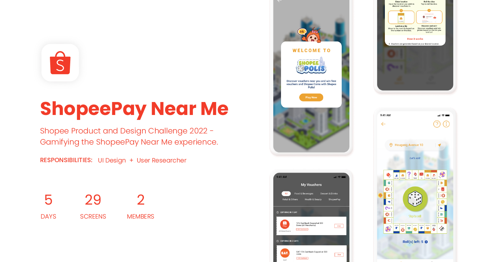
OVERVIEW
Context
This project was done as a part of the Shopee Product and Design Challenge 2022, a product management and UI/UX design-focused case competition. This year’s theme is “Tackling Real-World Tech Challenges in E-Commerce”.
Problem Statement
For this challenge, out of the five problem statements released, we chose the following:
ShopeePay Near Me - Creating the Top-of-mind Destination for Offline Discovery
ABOUT SHOPEEPAY NEAR ME
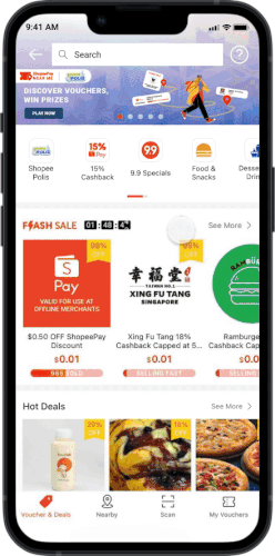
ShopeePay Near Me provides a one-stop solution to help users discover places to go, and good deals near them. It operates on an online-to-offline (O2O) business model that strives to bridge the gap between online customers and physical stores seamlessly by utilising location-based services to personalise the offerings.
AIM
ShopeePay Near Me aims to facilitate users’ where-to-go and what-to-eat decision-making and bring value to merchants by boosting their online presence.
PROMPT
With engagement at the forefront driven by omnichannel experience, propose a product solution(s) to strengthen ShopeePay Near Me's positioning as a top-of-mind destination for offline discovery.
Design Framework
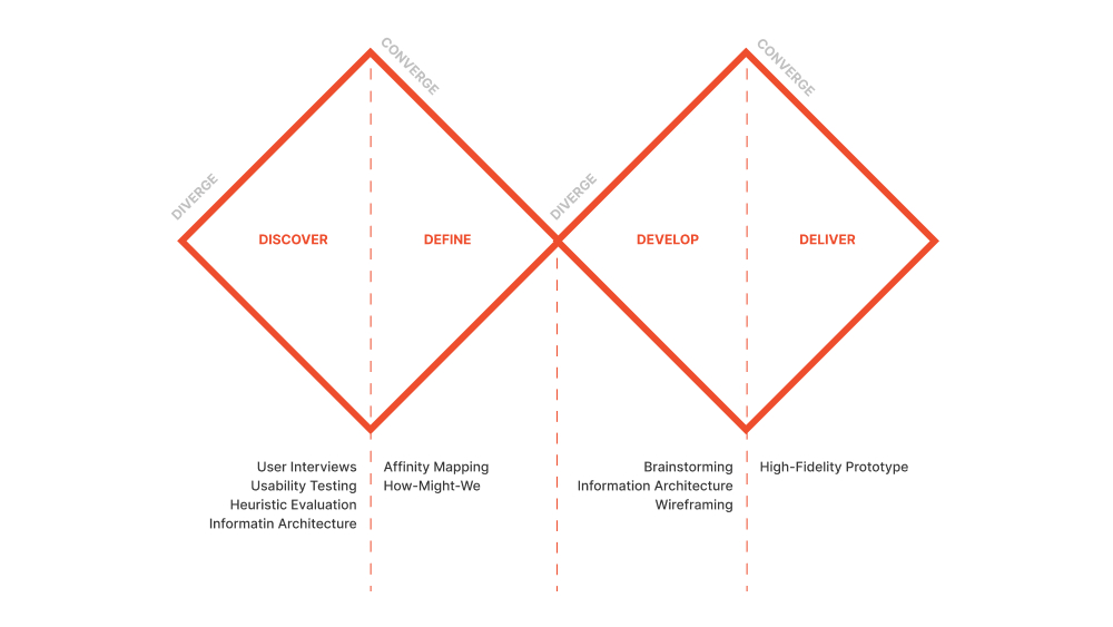
DISCOVER
User Interview & Usability Testing
We conducted a total of 5 interviews and usability testing with the following goals in mind:


Heuristic Evaluation
Using Jakob Nielson’s 10 general principles for interaction design, we evaluated the usability of ShopeePay Near Me as well as recorded other relevant observations.
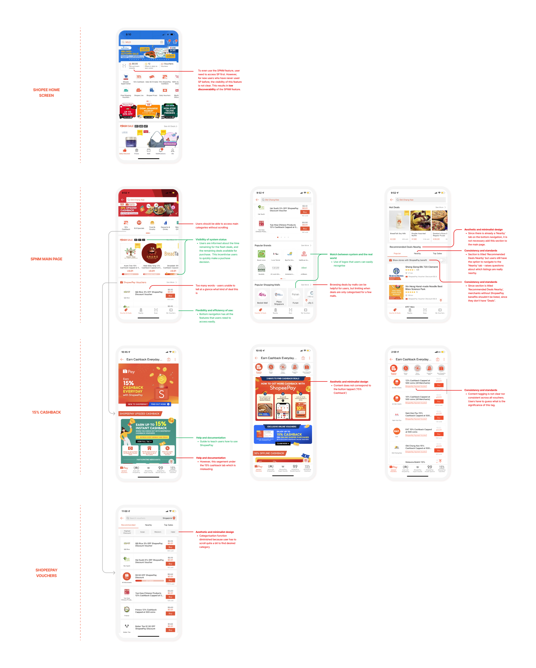
Information Architecture
We mapped out the existing information architecture of ShopeePay Near Me to prepare for the ideation stage, where we identify areas of improvement based on our research results and heuristic evaluation. Conducting both heuristic evaluation and drawing up the information architecture also helped us gain a deeper understanding of how ShopeePay Near Me works, which in turn helped us greatly in identifying areas of improvement in the ideation stage.

DEFINE
Affinity Mapping
Through affinity mapping, we identified common themes in users’ thoughts and experiences with ShopeePay Near Me based on our user interview and usability testing results.
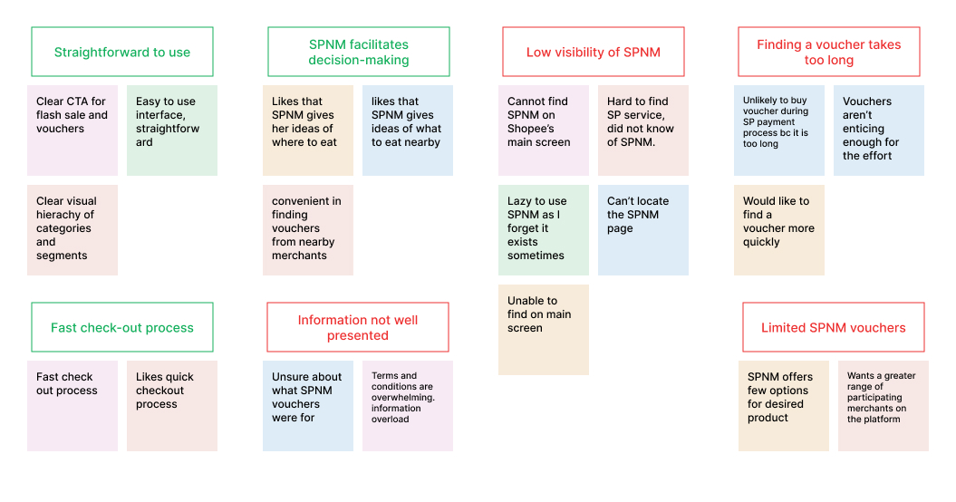
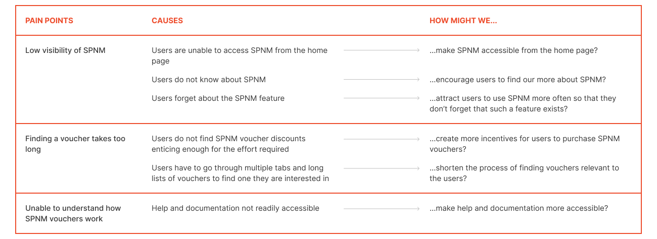
How Might We
From our affinity map, we identified three main pain points that can be addressed through design with the use of ShopeePay Near Me and generated respective How Might We statements, which helped us to identify what to focus on in the ideation stage.
DEVELOP
Brainstorming
For the brainstorming session, we used pen and paper to sketch out various ideas based on the How Might We statements.
Information Architecture
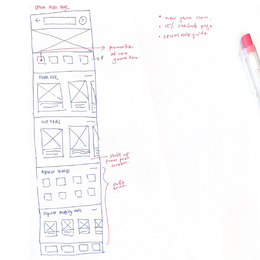
Once the key features and areas for redesign were decided, a new information architecture for ShopeePay Near Me was drawn up to prepare for wireframing.

Wireframes
DELIVER
High-Fidelity Prototype

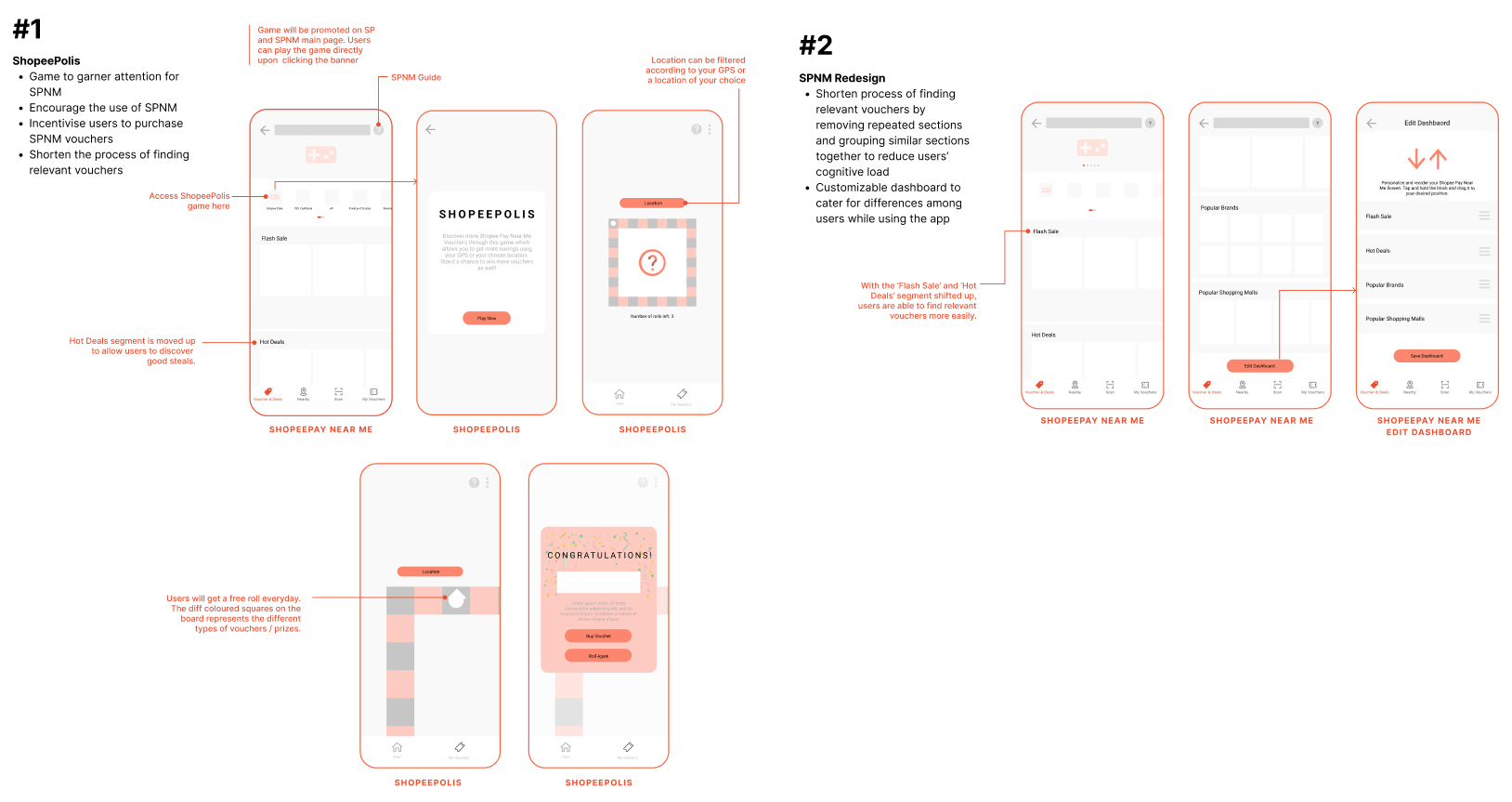
ShopeePolis
SHOPEEPOLIS LOGO
The logo was designed using Adobe Illustrator, inspired by the style of existing Shopee game logos.
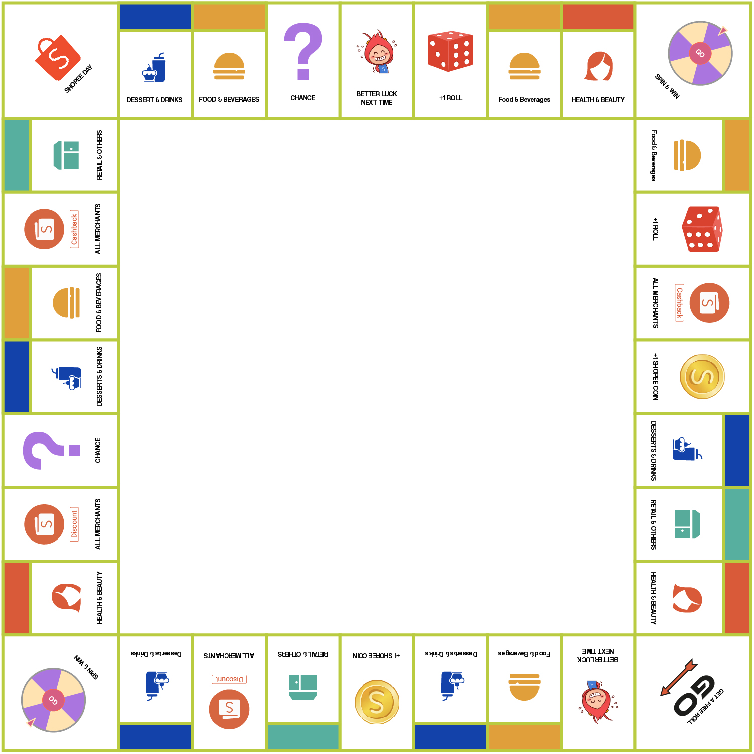
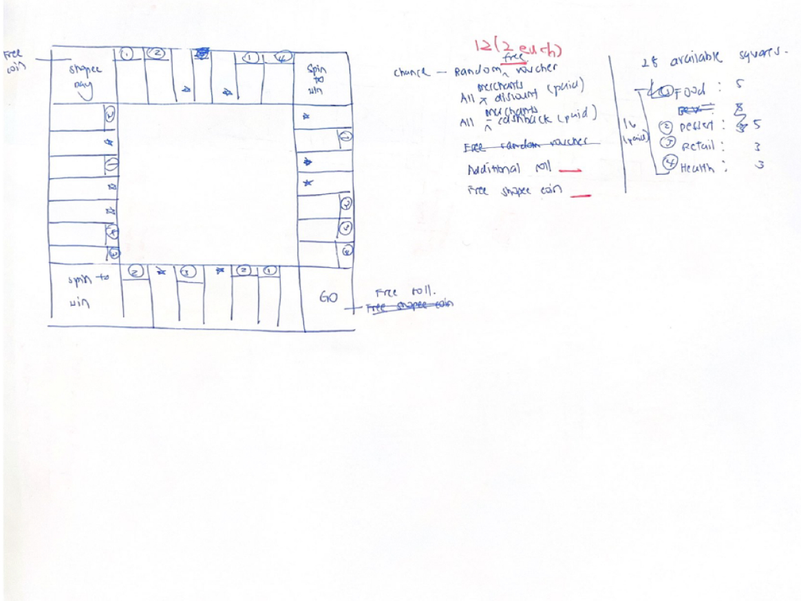
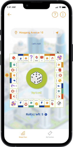
SHOPEEPOLIS BOARD
This board was also designed using Adobe Illustrator, inspired by Monopoly.
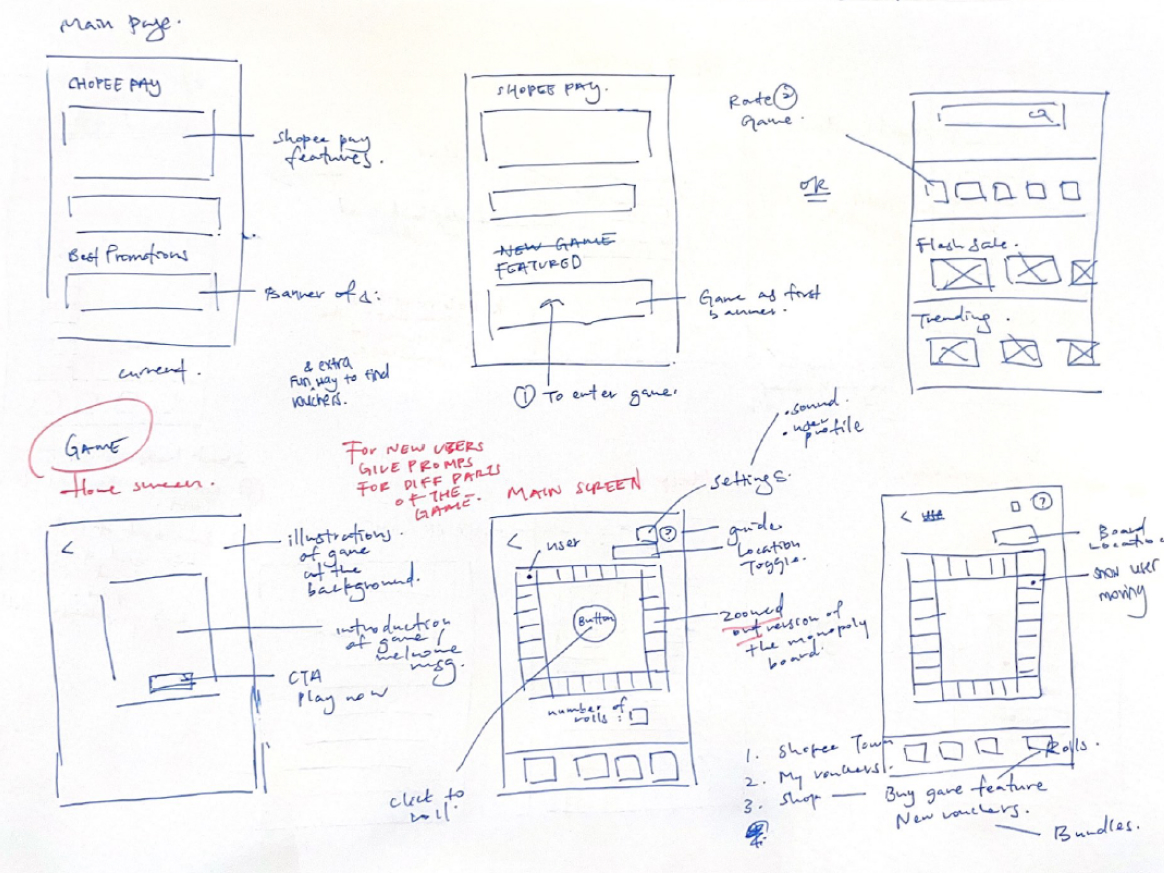
- Game Overview
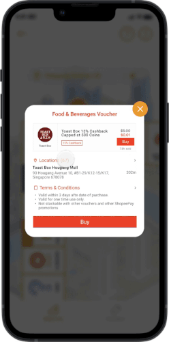
Inspired by the game Monopoly, ShopeePolis is a game made for users to discover new vouchers quickly and to bring about more awareness for SPNM. To begin, the user rolls a dice to determine how many steps they will take on the board. Depending on the tile the user’s token lands on, either a voucher will be generated based on the user’s location input, or a reward will be given to incentivise the user to play the game.
- How to Play
- The board comprises a total of 32 tiles - 28 small tiles and 4 big square tiles. These tiles are categorised into 4 main categories: Coloured Voucher tiles; All Merchants Voucher Tiles; Power Tiles and ‘Better Luck Next Time’ tiles.
- At the start of a new game, new users will get 5 free rolls. For current playing users, they will be given 1 free roll every day they log into the game. The players then move around the board based on the throw of their dice.
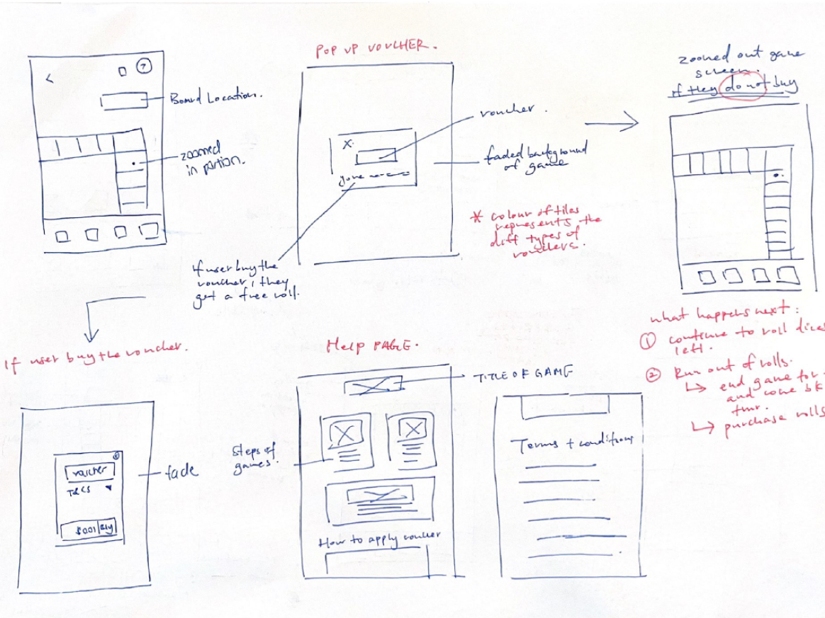
- Vouchers on the tiles are dependent on the location input - either using the user’s current location or a preferred searched location. When the player lands on a coloured tile, the user may choose to buy that recommended voucher or not.
- Certain power voucher tiles may result in favourable vouchers for them, depending on the type of power voucher they draw.
- A player continues to travel around the board until he or she is out of rolls for that day, and has the option to purchase more rolls using their Shopee Coins.
REFLECTIONS
Although we didn't manage to enter semi finals, this competition was really memorable for me because I took the plunge to enter it together with Xiao En, who was a total stranger to me before we started working on this together. It was a really valuable experience for me because it was the first time in a while where I am able to collaborate with another member on a project and I thoroughly enjoyed hearing a perspective different from mine.
Challenges
Because we do not have product management experience, we had some difficulty balancing between business goals and the users. During the design process itself we also questioned ourselves often whether we are prioritising one over the other. As user experience designers, this is a common dilemma in real-world projects and I'm glad I had a glimpse of what it's like through this project. Moving forward, I'd like to know how to navigate this dilemma better to create solutions that not only satisfy business goals but also enrich user experience.
Areas for Improvement
Looking back, since the prompt was to strengthen ShopeePay Near Me's positioning as a top-of-mind destination for offline discovery, a key process that we missed was competitive analysis, which would have helped us in coming up with a solution that has an edge over ShopeePay Near Me competitors as well as help support the case for our design.
Due to time constraints and lack of team members we were also unable to conduct usability testing, which was important to ensure that our design actually achieves our design goals.
Thank you for taking the time to read through my case study ◡̈