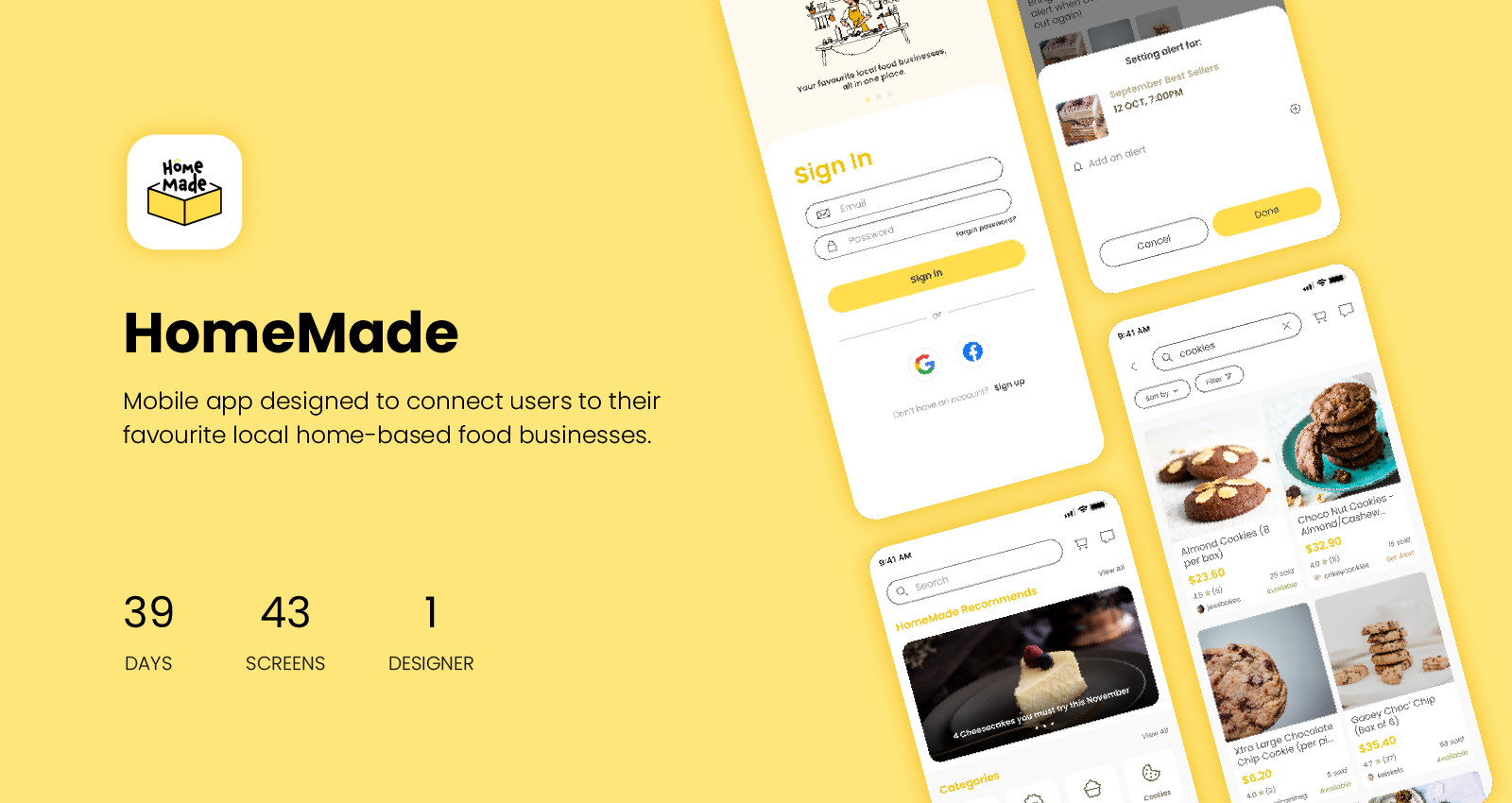
OVERVIEW
Context
This is a solo-project that was completed for my Mobile Interaction Design module in university, which took place in midst of the COVID-19 pandemic in 2020. During this period Singapore saw a surge in both the demand and supply for home-based F&B businesses as a result of lockdown measures.
Why
While Instagram was an attractive and cost-efficient platform for businesses to market their products and engage with their customers, customers often have to go through a few different applications throughout the discovery and buying process which can be cumbersome and lead to high drop-off rates.
What
HomeMade is a one-stop-shop mobile application for customers to browse, connect with and buy from local home-based F&B businesses.
RESEARCH
Competitive Analysis
To get a better understanding of the competitor landscape, I conducted analyses on two similar platforms that function as directories for local home bakers and hawker stores in Singapore. I found that they were limited in function and scope, and potential customers still had to navigate to other sites to browse through product selections and complete purchases.
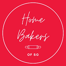
Home Bakers of SG
A non-profit directory website that features close to 500 home-bakers in Singapore.

Jiak
A community-run hawker directory that aims to help hawkers in Singapore.
User Interviews
I interviewed four individuals who have browsed for and/or purchased from home-based businesses before with the goal of finding out:
- how they typically come across home-based food businesses
- considerations when making purchase decisions from home-based businesses
- what do they like and not like about browsing for home-based businesses on Instagram
Secondary Research
Since my sample size is pretty small, I also conducted some secondary research to supplement my user interviews.
“Ms Rebecca Yong set an alarm for 8pm on Monday to remind herself to be at her laptop…(but) failed to get her hands on a box of goodies, as everything was sold out almost immediately.”
Source: The Straits TimesThe application has to be able to allow users to place their orders as quickly as possible.
“...Ms Lim agreed, noting that the number of steps needed to make payment could lead to customers dropping the transaction halfway, sometimes due to technical issues.”
Source: Channel News AsiaThe application should aim at cutting down the number of steps required to complete a transaction.
Key Findings

Customers enjoy the visual layout of Instagram when browsing for home-based businesses

Customers did not like that they have to switch between multiple platforms / applications to browse and buy from home-based businesses

The lack of a transparent review system makes customers doubt the trustworthiness of businesses
DEFINE
Jouney Mapping
Based on my user interview results as well as desk resarch findings, I organized my observations using a customer journey map to surface opportunities for improvement in the process, from discovery to purchase.
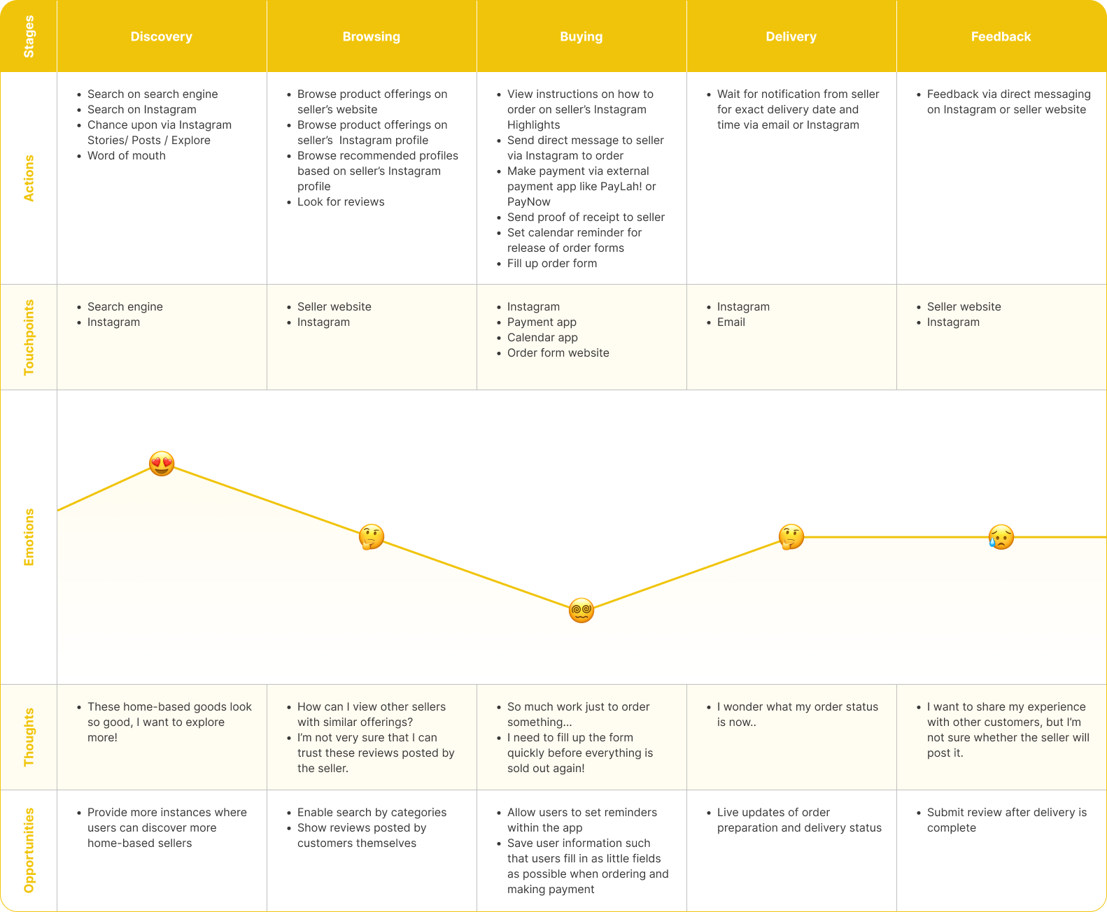
Problem Statement
Customers of home-based F&B businesses should be able to complete all steps of the process from discovery to purchase within the application to reduce the amount of work they have to do to make an informed purchase from local home-based businesses.
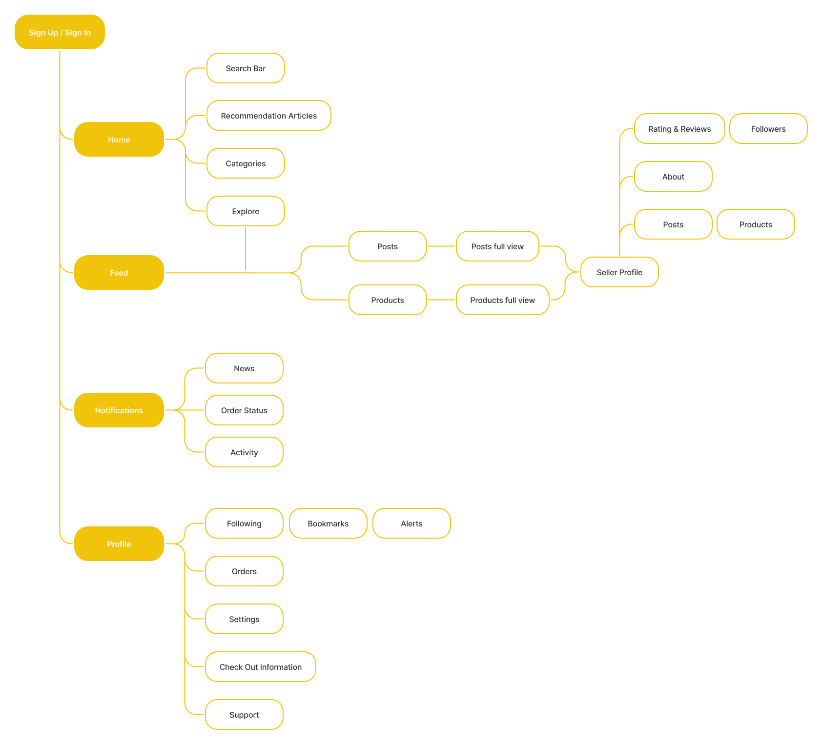
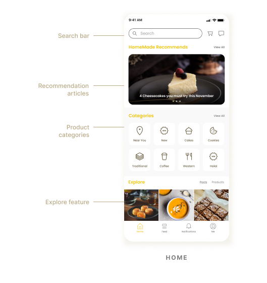
Core Features

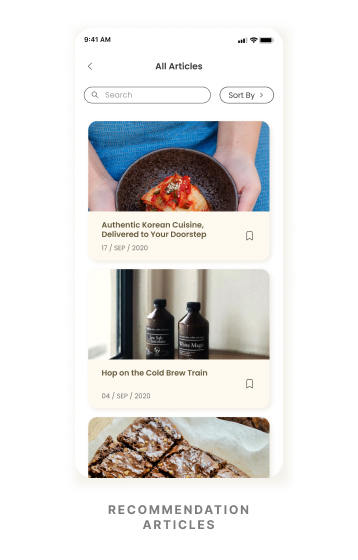
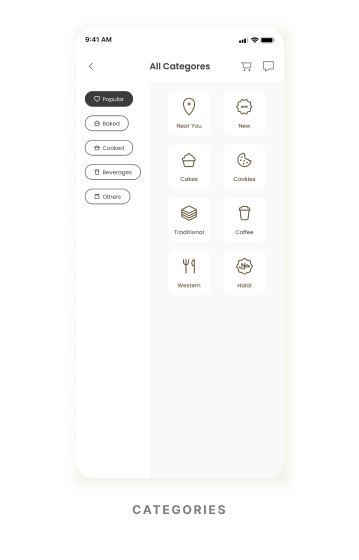
- Search bar
- Product categories
- Recommendation articles
- Explore feature
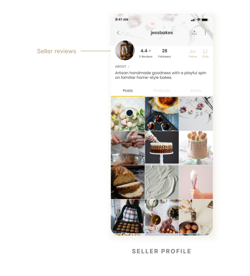
- Leave and view reviews by other users on seller profiles

- Set alerts by sending notifications to remind users when seller releases order slots

- Live status updates for users on each stage of the order preparation and delivery process
Sitemap
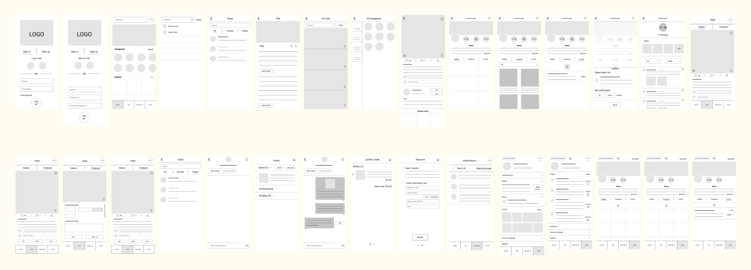
IDEATE
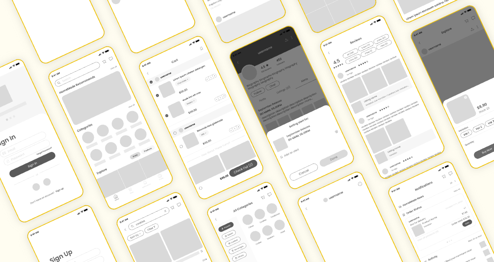
Low-Fidelity Prototype
After brainstorming, I put together the following low-fi prototype to conduct usability testing.
Usability Testing
Due to a tight deadline, I was only able to conduct 2 usability tests. The tests were conducted over Zoom and users were given mouse control to click interact with the low-fidelity prototype on Figma. Key insights were noted down to improve on in the final design.

- Users were familiar with the layout which is similar to Instagram, so minimal learning is required.

- Certain features lacked labelling so users were not aware of the affordances
- The ordering process wasn’t intuitive and found it hard to “add to cart"
Wireframes
DESIGN
Core Features

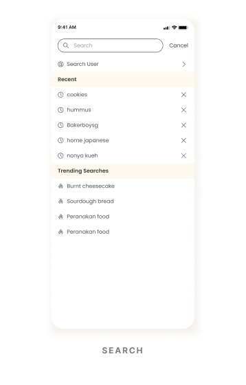
SEARCH & BROWSE
To facilitate product discovery, all supporting features are available on the home tab so that they are available once users open the application.
Based on feedback from usability testing, I have also included more labels such as "View All" to reduce guesswork on the users part.

REVIEW
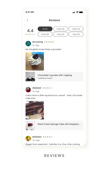
Average star rating and the total number of reviews left for the seller can be seen on the seller's profile. These metrics can give users an idea of sellers' product/service quality as well as sellers' popularity.

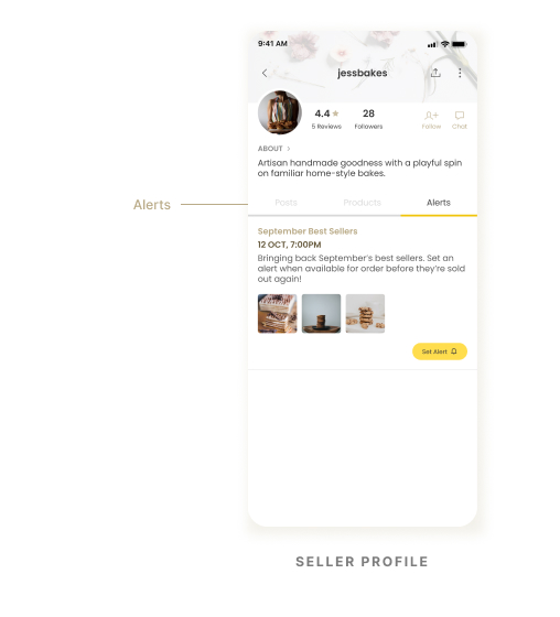
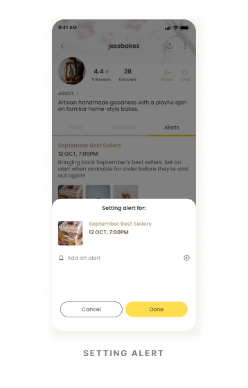
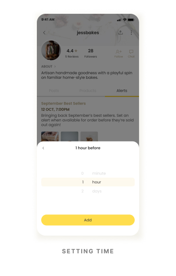
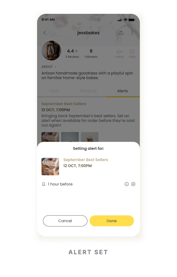
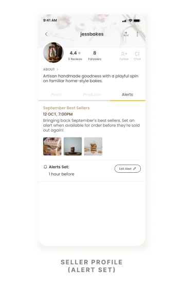
REMINDERS
From the seller's profile, users can set multiple alerts in advance of any product releases so that they can prepare to check out the products they want as soon as they are released. This feature eliminates the need for users to navigate outside the app to set their own reminders.

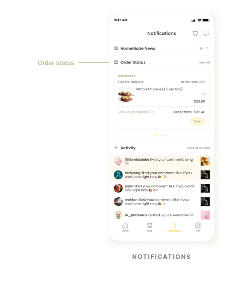
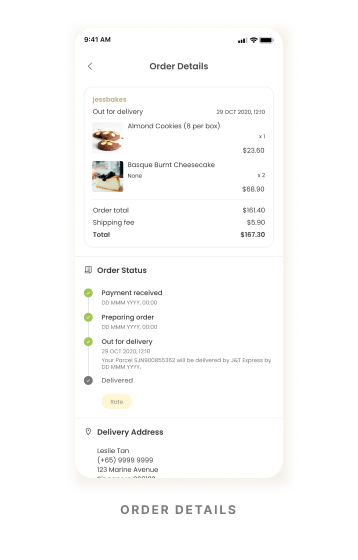
ORDER STATUS
Users can check the latest status update of their orders from the Notifications tab. The card will disappear once the order is completed, i.e. user has received the order and given a rating.
High-Fidelity Prototype - Video Demo
REFLECTIONS
Working on an entire mobile application alone whilst being involved in every step of the UI/UX process for the first time proved to be really challenging. The tight deadline also limited the number of research techniques that I could employ to refine my final design, but also extremely rewarding.
HomeMade was designed with customers of home-based businesses in mind - however, being an application designed to connect both customers and businesses together, it should also take into consideration of the businesses’ needs as well. If this project were to continue, further user research on local home-based businesses will need to be conducted and modifications to the existing design will need to be made to accommodate both user groups.
My main takeaway from this project is to not fall in love with your design. I was initially really excited about certain concepts, but after conducting usability tests I quickly realised what I may think is a good idea, isn’t actually the case for users. Through this I have learnt not to be too attached to any particular ideas, to always be open and also fully understood the importance of usability testing.
Thank you for taking the time to read through my case study ◡̈